Editor’s Pick: Data Analysis, Graphing and Presentation Suite Improved
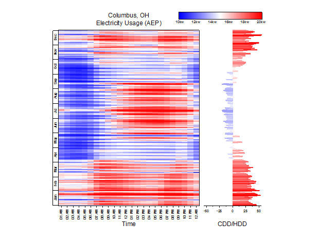
New graph types in Origin and OriginPro 2015 include column scatter, kernel density plot, custom percentile and jitter points in box chart and, pictured here, heat map. Image courtesy of Origin Corp.


Latest News
November 5, 2014
 Dear Desktop Engineering Reader:
 OriginLab Corp. has released the 2015 versions of its Origin and OriginPro data analysis, graphing and publishing software. Origin is widely used in engineering and scientific settings ranging from corporations to government agencies to research labs and academia worldwide. So when OriginLab releases a major update, it’s news worth knowing more about.
Should you be unfamiliar with Origin, the first thing to know is that it has been available since 1992 and has steadily grown in popularity. More than 500,000 registered users at nearly 20,000 companies, government agencies, research labs and universities rely on it. Suffice to say, it’s got the chops.
Origin is the primary application suite. OriginPro is for the most demanding users and gnarliest data analysis jobs. It has all the features of Origin but offers more advanced and unique data analysis functionality in such areas as peak fitting, surface fitting, statistics, signal processing and image processing.
Origin deploys with a user-customizable multi-sheet workbook model that supports up to tens of million rows and tens of thousands columns per sheet. Its user interface is engineered to be easy to use even for people new to the application. You can embed graphics and metadata in worksheets, and you can enhance your workbooks and data presentations by using Sparklines in worksheet column headers or worksheet cells. Sparklines, a concept advanced by data visualization innovator Edward Tufte, are small graphics embedded in context that summarize key data points. Think of those small stock price trend lines you might see after a company’s name on a business wire, only here you can use them to represent key points or trends in your data.
In addition to Origin’s peak analysis, curve fitting, statistics and signal processing data analysis capabilities, the software offers more than 100 built-in graph types. These range from contour, 2D and 3D graph types to a number of specialty graphs like windrose as well as statistical plots like histograms and Pareto. Origin also has built-in programming languages to help you automate graphing and analysis jobs, an integrated project explorer to help you organize your Origin projects and extensive import/export capabilities.
The 2015 release of Origin and OriginPro introduces more than 100 new features and upgrades compared to its immediate predecessor, including several ease-of-use enhancements recommended by users. The Origin 2015 version of the Project Explorer feature for helping you organize projects sees a number of improvements, including a new find and search functionality that enables users to locate a string anywhere in a project. Other Project Explorer enhancements include a neat facility that lets you view extra large icons for previewing multiple graphs simultaneously.
Among the other enhancements in Origin 2015 highlighted by Origin are Microsoft Office style collapsible menus for some very long menus and context menus that, by default, only show commonly-used menus. The graph axis dialog for customizing axis scale values, colors and line weights as well as linking axis scale values or controlling axis labels by values in a dataset has been redesigned to be easier to use. Graph legends have been improved with an enhanced color-map scale as well as support for bubble scales.
New analysis and statistics capabilities in Origin 2015 include repeated measure ANOVA tools that support unequal sample sizes. New graph types include heat mapping and 2D kernel density plots. You also now have access to 3D batch plotting and user-defined ordering of categorical data. The 2015 release also adds new support for the Python scripting language.
The 2015 edition of OriginPro has a new Distribution Fit functionality to help you fit a parametric distribution to data. It also has new T-test on Rows functionality that can help you examine the distribution of data and estimate parameters for a distribution.
You can read more about Origin and OriginPro in today’s Pick of the Week write-up. Set aside a few minutes — seven to be precise — and watch the video on the key new features in the 2015 release. You’ll also find links comparing the two versions to help you determine which is right for your needs. Still, the best way to learn what’s going on with Origin and OriginPro 2015 is to give it a test drive. Hit the link at the end of the main write-up and register for a complimentary, fully functional 21-day evaluation. The short of it is that Origin and OriginPro provide comprehensive solutions for analyzing, graphing and presenting engineering and scientific data professionally. It’s worth your time becoming more familiar with them.
Thanks, Pal. — Lockwood
Anthony J. Lockwood
Editor at Large, Desktop Engineering
Read today’s pick of the week write-up.
This is sponsored content. Click here to see how it works.
Subscribe to our FREE magazine, FREE email newsletters or both!
Latest News
About the Author
Anthony J. Lockwood is Digital Engineering’s founding editor. He is now retired. Contact him via [email protected].
Follow DE