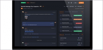
In an upcoming release of HyperWorks, users can pull up the familiar commands hidden in a slider bar at the bottom of the screen or work entirely in the new interface, modeled after solidThinking Inspire. Image courtesy of Altair.
Latest News
July 1, 2015
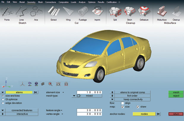 In an upcoming release of HyperWorks, users can pull up the familiar commands hidden in a slider bar at the bottom of the screen or work entirely in the new interface, modeled after solidThinking Inspire. Image courtesy of Altair.
Blaise Pascal, a 17th century French philosopher and mathematician, wrote in a letter: “I have made this longer than usual because I have not had time to make it shorter.” American literary giant Mark Twain is also credited with some variants of the same witticism. Commenting on the growing complexity in CAD and product lifecycle management (PLM) software, David McLaughlin, Siemens PLM Software’s user experience (UX) lead for Active Workspace, inadvertently echoed Pascal and Twain. “It’s really hard to make things simple; it’s really easy to leave things complicated,” he says.
Engineering software complexity was the prevailing tradition. It was accepted as a tolerable tradeoff for the richness in features, swelling up with each new release. Some users even learned to take pride in their mastery of complex programs, which ensured job security. But the rise of mobile devices and ubiquitous apps appear to challenge this practice. People’s expectations of technology are now drastically different. They want devices to be intuitive and foolproof; they won’t tolerate software that demands a high learning curve.
The new consumer mentality is putting pressure on the design software industry to reform. Some vendors have already initiated interface overhauls. In those projects, developers take on what seems like an impossible mission: to reinvent their products for the new generation without alienating their loyal user base.
Guided by the Compass
Philippe Laufer, CEO of Dassault Systemes CATIA, explained the dilemma of CAD interface redesign. “We have some customers with thousands of CATIA users. Each of them spends thousands of hours on CATIA every year,” he says. “That’s millions of hours spent on CATIA every year. So if we change something in the software that affects productivity, these customers feel the pain.”
Laufer regularly seeks input from a network of user advocates and champions, whose job it is to make the case for user-desired changes. At Dassault Systemes, Laufer said UI (user interface) changes are governed by what the company calls “fundamentals:” mobile friendliness, natural controls, productivity and consistency across different brands.
When preparing for a new release of CATIA, Laufer estimates he and his team consider approximately 1,000 user requests, issues and topics. They usually implement about 500 new functions and artifacts in each new version. “Not all of those 500 are from the users,” he says, “because we add our own to the list too.”
UI design demands the gift of anticipation, the ability to spot what the users need before they request it. Case in point: The 3DEXPERIENCE Compass. It’s now an integral part of Dassault Systemes’ brand aesthetics. It’s also the anchor point for navigating the company’s software suites. At first it was a novelty, a departure from the typical drop-down menus in CAD and PLM interfaces. “First people asked, what is it?” says Laufer. “Now that users have discovered its power, it has become the way they explore.”
The compass divides distinct workflows—social collaboration, product data, simulation apps and modeling apps—into its north, east, south, and west buttons. The center, marked by an oversized arrow, signifies real-time visualization of design. These placements and groupings were not arbitrary. For example, there’s a good reason the social apps are pegged to the most prominent northern tip in the Compass. “Designers are not social by nature, as we found out,” says Laufer, “so now, with that Compass, they have easy access to their peers to discuss design challenges.”
Sometimes Laufer’s team has to find creative ways to accommodate users’ habits as they modernize the interface. The current look and feel of CATIA is clean and de-cluttered, with the screen real estate reserved mostly for 3D model display.
“To do that, we had to minimize the number of icons that appear by default in the Action bar at the bottom,” says Laufer. “Then we heard from one CATIA guru that when he’s working, he has 148 icons [or shortcuts] in his Action bar. So we prototyped, tested and created a way for these users to use the iPad as the second screen to house their shortcuts and custom icons.”
Starting from Scratch
In the first week of 2015, Jon Hirschtick, cofounder of SolidWorks, set out to explain why he and his colleagues felt the need to reinvent CAD with their Onshape startup. In a blog post titled “Why we started from scratch (again) in the CAD business,” he listed the top two reasons:
1. The way that design and manufacturing teams work together has dramatically changed.
2. We are in the midst of the biggest change yet in computing platform technology, from the old world of desktop PCs to the new world of cloud, Web and mobile computing.
But starting from scratch doesn’t mean Onshape can ignore the established practices. “We don’t have to deal with the restrictions of legacy code. Still, there’re lots of hard-baked ideas of how things should work,” says Lou Gallo, member of Onshape’s user experience (UX) design team.
Onshape retains the classic parametric modeling methods in 2D profile extrusion, cutting holes, blending edges and many other areas. But the software’s cloud-hosted architecture gives them the ability to introduce auto-save. Users don’t have to initiate the Save command; the software regularly saves the latest version, much in the same way Google Docs works.
“When users stop worrying about making mistakes that could be hard to fix, it frees them to focus on their design ideas instead,” says Gallo. The same function might be possible in a desktop program; but, Gallo points out it is better suited for the cloud’s infinite storage capacity and collaboration-friendly architecture.
Inside Onshape, users may invoke the Feedback command, which freezes the screen and presents a series of annotation tools (Comment, Highlight, Virtual Pen and Arrows, to name a few). The function can be used to create a screen capture of what users feel is a flaw or a bug in Onshape to send to the developers.
“Because the software is running from a browser, I can extract relevant information about their OS, browser version and graphics from the feedback they submit,” says Gallo.
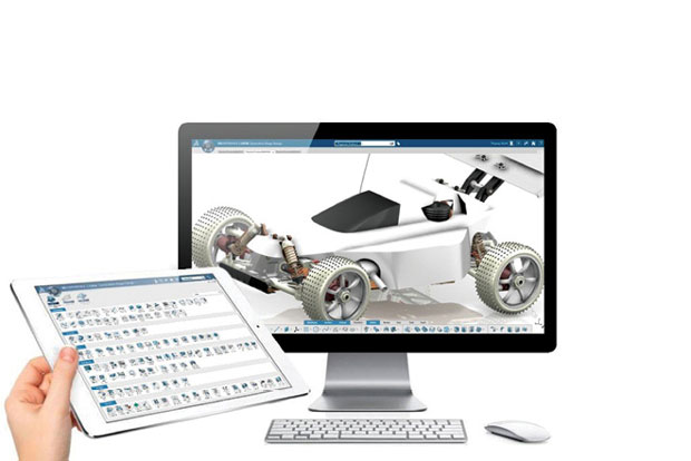 To accommodate power users who like access to a toolbar with hundreds of icons, Dassault Systèmes created a way to load custom icons on a mobile device. Image courtesy of Dassault Systemes.
The Model is the Menu
Another developer making a break from the past is Altair, best known for its CAE software. Its flagship product, HyperWorks, is deeply rooted in the older Windows OS aesthetics, marked by menu bars and dialog boxes.
“[The desire for a UI change] has been mounting over the last few years,” said James Dagg, Altair’s CTO for Modeling and Visualization. “Older users know how to use the product. It’s second nature to them. But among younger users, those who are coming out of college, the expectation is different. It was hard to train them on a UI that requires too much hidden knowledge.”
In redesigning the HyperWorks UI, Altair is guided by the success of solidThinking Inspire, one of its products introduced in 2009. Targeted at the designers rather than simulation experts, the product lets users conduct topology optimization in a clean, guided user interface. The Inspire UI also benefitted from the involvement of graphics designers, whose demand for simple elegance nudges the product toward icons and context-sensitive popups instead of command lines and input fields.
Part of the intuitiveness comes from Inspire’s use of 3D icons that offer clues to the operations they represent. Inspire icons are slightly larger than normal CAD software icons. The icon for Blend, for instance, lights up the rounded edges in the miniature model when you hover your mouse over it. Similarly, the Hole command lights up the holes visible in the icon. This approach gives users clear visual clues to the operations executable.
“In our usability labs, we don’t give testers lots of directions or instructions. We just let them use the software, let them stumble and take notes,” says Chris Peterson, director of UX at Altair.
Dagg and Peterson feel the responsibility to shepherd the previous users through the transition. The hand-holding takes the form of an unobtrusive slider. “You can pull that slider up from the bottom of your screen to get access to your old menu items,” Dagg says. “First we were worried the slider might make the old users never migrate to the new one. But it’s been surprising to see that even the old users, once they got over a small hump, are happy to go along with the new tools. I expect in two to three years, most of them won’t be using the slider bar.”
Altair plans to release the next HyperWorks as two executables: HyperWorks 14, which works only in the classic mode; HyperWorks 14X, which gives access to the old and the new UI.
The New Face of PLM
The new face of Siemens PLM Software’s Teamcenter system is called Active Workspace, a browser-based, mobile-friendly client. Much of the inspiration for the look and feel comes from smartphones, revealed McLaughlin.
“Find a button on your phone that doesn’t work,” he says. “I bet you can’t find one. They all have a function. That’s the approach we’re taking.” Typically, CAD and PLM interfaces give you all the buttons you could want in the main screen. If certain commands and buttons are irrelevant to the task at hand, they may be grayed out. But that’s not good enough for McLaughlin.
“We don’t keep grayed out buttons; we remove them from the screen if they’re not useful,” he says. “That means, there are no dead clicks, and users can’t make too many mistakes. We think you’d like to work in a world with seven buttons instead of 40 buttons.”
In 2010, Siemens PLM Software unveiled what it described as HD PLM, the use of the 3D assembly model itself as the navigation interface for finding and displaying project and product data housed in Teamcenter.
“The traditional approach is to look at the tabulated data [part number, part owner, release status, cost, and so on], then ask the software to show you what the part looks like. We decided to flip it around. We use the product you’re working on to communicate the other data associated with it. So, for example, you can see parts that are on-hold or parts with compliance issues highlighted in red,” says McLaughlin.
Active Workspace runs on any modern computing device from a standard browser with HTML5 support. There is no special app to install or any special plug-ins required. The code is multi-touch enabled, so if you launch Active Workspace from a touch-supported device (iPad or Microsoft Surface Pro, for instance), you would be able to use fingertips to control and navigate.
Not One-Size-Fits-All
The developers undertaking UI redesign are recognizing the one-size-fits-all approach is no longer favored by users. In fact, it might have been one of the characteristics that drove the software toward its current complexity.
“You won’t navigate inside a virtual building the same way you navigate through a mechanical assembly. The designer prefers crisp, clear, on-screen visualization even without ray tracing; the mechanical engineer cares more about software performance,” says Dassault Systemes’ Laufer. Catering to different industry segments, Dassault Systemes partners with Boeing, Toyota, Procter & Gamble and architecture firms to ensure it can offer different configurations of CATIA that fit the habit, taxonomy and workflow requirements in different industries.
There’s also mounting pressure to support mobile platforms to harness the device’s eccentricities and distinct characteristics. Onshape has recently released Onshape Mobile (iOS version is available; Android version is on the way), which goes beyond viewing and markup. It’s designed to let you build and edit parts from scratch with fingertip input.
Siemens PLM Software recently announced that you can interact with its Solid Edge CAD software using the Microsoft Surface Pro 3 tablet’s touchscreen, click-in Surface Type Cover, mouse or the Surface Pen. When using the Surface Pen, different UI options are available.
Dassault Systemes’ Laufer is not ready to reveal the details about the R&D initiative his team is undertaking with Microsoft to put CATIA on a Surface Pro tablet, but he promises the changes will “disrupt the way people have been working.”
“As an industry, we kept moving toward power [in our software], but lost sight of simplicity. We put in powerful features, just in case someone might need them. We forgot there are people who don’t need all this power onscreen all of the time,” says Siemens’ McLaughlin.
Heavily populated toolbars, once considered a hallmark of professional engineering software, are not seen as a virtue to the iPad generation. Design software UI’s return to simplicity will likely accelerate as users show greater comfort and reliance on the cloud, mobile devices and gesture computing.
More Info
Subscribe to our FREE magazine, FREE email newsletters or both!
Latest News
About the Author
Kenneth Wong is Digital Engineering’s resident blogger and senior editor. Email him at [email protected] or share your thoughts on this article at digitaleng.news/facebook.
Follow DE